
So the other day someone on cross-validated asked about visualizing categorical data, and spineplots was one of the responses. The OP asked if a solution in SPSS was available, and there is none currently available, with the exception of calling R code for Mosaic plots, which there is a handy function for that on developerworks. I had some code I started to attempt to make them, and it is good enough to show-case. Some notes on notation, these go by various other names (including Marimekko and Mosaic), also see this developerworkds thread which says spineplot but is something a bit different. Cox (2008) has a good discussion about the naming issues as well as examples, and Wickham & Hofmann (2011) have some more general discussion about different types of categorical plots and there relationships.
So instead of utilizing a regular stacked bar charts, spineplots make the width of the bar proportional to the size of the category. This makes categories with a larger share of the sample appear larger. Below is an example image from a recent thread on CV discussing various ways to plot categorical data.
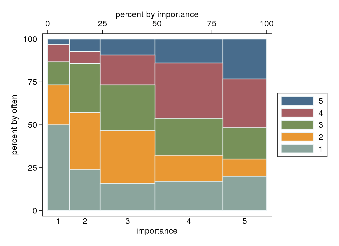
This should be fairly intuitive what it represents. It is just a stacked bar chart, where the width of the bars on the X axis represent the marginal proportion of that category, and the height of the boxes on the Y axis represent the conditional proportion within each category (hence, all bars sum to a height of one).
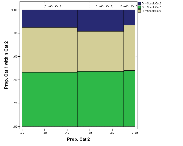
Located here I have some of my example code to produce a similar plot all natively within SPSS. Directly below is an image of the result, and below that is an example of the syntax needed to generate the chart. In a nutshell, I provide a macro to generate the coordinates of the boxes and the labels. Then I just provide an example of how to generate the chart in GPL. The code currently sorts the boxes by the marginal totals on each axis, with the largest categories in the lower stack and to the left-most area of the chart. There is an optional parameter to turn this off though, in which case the sorting will be just by ascending order of however the categories are coded (the code has an example of this). I also provide an example at the end calling the R code to produce similar plots (but not shown here).
Caveats should be mentioned here as well, the code currently only works for two categorical variables, and the labels for the categories on the X-axis are labelled via data points within the chart. This will produce bad results with labels that are very close to one another (but at least you can edit/move them post-hoc in the chart editor in SPSS).
I asked Nick Cox on this question if his spineplot package for Stata had any sorting, and he replied in the negative. He has likely thought about it more than me, but I presume they should be sorted somehow by default, and sorting by the marginal totals in the categories was pretty easy to accomplish. I would like to dig into this (and other categorical data visualizations) a bit more, but unfortunately time is limited (and these don’t have much direct connection to my current scholarly work). There is a nice hodge-podge collection at the current question on CV I mentioned earlier (I think I need to add in a response about ParSets at the moment as well).
********************************************************************.
*Plots to make Mosaic Macro, tested on V20.
*I know for a fact V15 does not work, as it does not handle
*coloring the boxes correctly when using the link.hull function.

*Change this to whereever you save the MosaicPlot macro.
FILE HANDLE data /name = "E:\Temp\MosaicPlot".
INSERT FILE = "data\MacroMosaic.sps".

*Making random categorical data.
dataset close ALL.
output close ALL.

set seed 14.
input program.
loop #i = 1 to 1000.
    compute DimStack = RV.BINOM(2,.6).
    compute DimCol = RV.BINOM(2,.7).
    end case.
end loop.
end file.
end input program.
dataset name cats.
exe.

value labels DimStack
0 'DimStack Cat0'
1 'DimStack Cat1'
2 'DimStack Cat2'.
value labels DimCol
0 'DimCol Cat0'
1 'DimCol Cat1'
2 'DimCol Cat2'.

*set mprint on.
!makespine Cat1 = DimStack Cat2 = DimCol.
*Example Graph - need to just replace Cat1 and Cat2 where appropriate.
dataset activate spinedata.
rename variables (DimStack = Cat1)(DimCol = Cat2).
GGRAPH
  /GRAPHDATASET NAME="graphdataset" VARIABLES=X2 X1 Y1 Y2 myID Cat1 Cat2 Xmiddle
  MISSING = VARIABLEWISE
  /GRAPHSPEC SOURCE=INLINE.
BEGIN GPL
 SOURCE: s=userSource(id("graphdataset"))
 DATA: Y2=col(source(s), name("Y2"))
 DATA: Y1=col(source(s), name("Y1"))
 DATA: X2=col(source(s), name("X2"))
 DATA: X1=col(source(s), name("X1"))
 DATA: Xmiddle=col(source(s), name("Xmiddle"))
 DATA: myID=col(source(s), name("myID"), unit.category())
 DATA: Cat1=col(source(s), name("Cat1"), unit.category())
 DATA: Cat2=col(source(s), name("Cat2"), unit.category())
 TRANS: y_temp = eval(1)
 SCALE: linear(dim(2), min(0), max(1.05))
 GUIDE: axis(dim(1), label("Prop. Cat 2"))
 GUIDE: axis(dim(2), label("Prop. Cat 1 within Cat 2"))
 ELEMENT: polygon(position(link.hull((X1 + X2)*(Y1 + Y2))), color.interior(Cat1), split(Cat2))
 ELEMENT: point(position(Xmiddle*y_temp), label(Cat2), transparency.exterior(transparency."1"))
END GPL.

*This makes the same chart without sorting.
dataset activate cats.
dataset close spinedata.
!makespine Cat1 = DimStack Cat2 = DimCol sort = N.
dataset activate spinedata.
rename variables (DimStack = Cat1)(DimCol = Cat2).
GGRAPH
  /GRAPHDATASET NAME="graphdataset" VARIABLES=X2 X1 Y1 Y2 myID Cat1 Cat2 Xmiddle
  MISSING = VARIABLEWISE
  /GRAPHSPEC SOURCE=INLINE.
BEGIN GPL
 SOURCE: s=userSource(id("graphdataset"))
 DATA: Y2=col(source(s), name("Y2"))
 DATA: Y1=col(source(s), name("Y1"))
 DATA: X2=col(source(s), name("X2"))
 DATA: X1=col(source(s), name("X1"))
 DATA: Xmiddle=col(source(s), name("Xmiddle"))
 DATA: myID=col(source(s), name("myID"), unit.category())
 DATA: Cat1=col(source(s), name("Cat1"), unit.category())
 DATA: Cat2=col(source(s), name("Cat2"), unit.category())
 TRANS: y_temp = eval(1)
 SCALE: linear(dim(2), min(0), max(1.05))
 GUIDE: axis(dim(1), label("Prop. Cat 2"))
 GUIDE: axis(dim(2), label("Prop. Cat 1 within Cat 2"))
 ELEMENT: polygon(position(link.hull((X1 + X2)*(Y1 + Y2))), color.interior(Cat1), split(Cat2))
 ELEMENT: point(position(Xmiddle*y_temp), label(Cat2), transparency.exterior(transparency."1"))
END GPL.
*In code online I have example using Mosaic plot plug in for R.
********************************************************************.
Citations of Interest
- Cox, Nick (2008). Speaking Stata: Spineplots and their kin. The Stata Journal 8(1):105-121.
- Wickham, Hadley, and Heike Hofmann. (2011) Product plots. IEEE Transactions on Visualization and Computer Graphics 17(12):2223-2230. PDF here.


Jon K Peck
/ April 21, 2013Hi Andy,
I wonder whether you could make this plot by using the interval.stack function with the size function.
BTW, I really like the structure plot in this thread. http://stats.stackexchange.com/questions/56322/graph-for-relationship-between-two-ordinal-variables?newsletter=1&nlcode=16499|b836 Might be worth building an extension command for this.
Regards,
Jon Peck (no “h”) aka Kim Senior Software Engineer, IBM peck@us.ibm.com phone: 720-342-5621
apwheele
/ April 22, 2013I believe you *can’t* use stacking when the scale is continuous (but it would be nice for this if you could).
I will make a separate post on how to make the structure plot (you can’t do it through the GUI directly, but I will highlight the path to least resistance so to speak). It will be a good how-to on using continuous color and size scales as well.
Meghan
/ April 28, 2021I’m struggling with where to find the macro or even better stand-alone SPSS code
apwheele
/ April 28, 2021Here is a direct link to the macro code, https://github.com/apwheele/Blog_Code/blob/master/SPSS/MacroMosaic.sps. You can uncomment out the end portion to show how to use the macro.
If you go to https://code.google.com/archive/p/andrewpwheeler-wordpress/downloads#makechanges you can download the MosaicPlot.zip file that has data as well.