
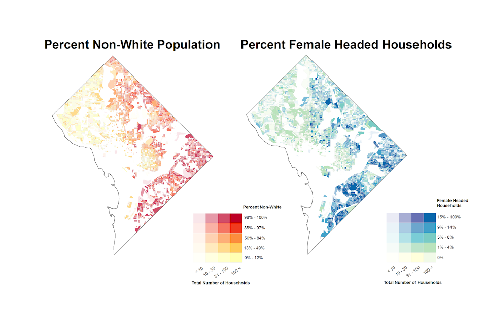
I’ve made some more value-by-alpha maps for my dissertation for percent non-white population in comparison to percentage of female-headed households for Census blocks in 2010 in D.C. See my first post for some background. The choropleth classes for the percents are chosen according to quintiles of the distributions and the alpha classes are arbitrary (note the alpha class uses households as the baseline in both maps, even though percent non-white uses the population counts).
When making these maps I’ve found that the Color Brewer sequential styles that range two colors work out much better than those that span one color. What happens with the one color sequential themes is that the faded out colors end up being confounded with the lighter colors in the fully opaque ranges. When using the two sequential color schemes (here showing Yellow to Red and Yellow to Blue) it provides greater discrepancy between the classes.
I did not try out the black background for these maps (I thought perhaps it would be a bit jarring in the document have a swath of black stand out). The CUNY Center for Urban Research has some other example value-by-alpha maps for New York City elections in 2013. After some discussion with Steven Romalewski they decided they liked the white background better for there maps, and my quick attempts for these examples I think I agree.


Steven Romalewski (@SR_spatial)
/ May 13, 2014Great maps. Thanks for the shoutout. Your blog posts are always helpful, thanks!